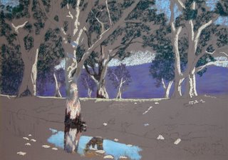
The mountain has purple and blue scraped on the paper then rubbed into the support. This will have numerous lighter tones laid over the top. I find this helps give me depth in the mountain rather than a flat expanse of area.
As you can see I did take the middle tree out that has the dark trunk. I felt that it was too centered and not good for the over all design.
Hopefully I will have anther posting tomorrow.

No comments:
Post a Comment