Wednesday, May 31, 2006

Flinders Range Wattle Still Life "WIP" eight

I tweaked the water line level and the bumps on the left hand side have also been nipped back on the vase.

The copper kettle is now well on the way. There will be more shaping done yet with tonal values. The edges are to be tidied up and the perspective checked.

I have never painted shiny metal before and finding it very interesting to implement.


Technorati tags: art, pastel, vase, copper

Tuesday, May 30, 2006

Flinders Range Wattle Still Life "WIP" seven

The “kissing leaves to other objects now have been sorted out.

The vase also now is looking much better. I feel I know this item intimately now and don’t have any qualms in using it again in a future still life. I may need to darken the area just under the kettle spout to make the copper pop forward. As I work on the kettle I will decide then what I am going to do.

There is a very thin layer of pastel on the kettle handle and knob. Until I make sure that the drawing is correct in this area I will not go heavy with pastel application.


Technorati tags:
art, pastel, vase, copper

Monday, May 29, 2006

I'm Back!

Sorry about the lack of posting on my blog. My excuse is I have been away having a ball visiting family in Adelaide.

The still life that I am working on at the moment has given me a taste for more works in the future. I purchased a few lengths of fabric of different colours while in Adelaide just for that purpose.

I wouldn’t mind some more props to include but until I see something that really speaks to me and says “paint me” it might take awhile to find them.

With a bit of luck I should have an update of the Wattle still life tomorrow.

Thursday, May 25, 2006

Graphite Studies

There isn’t going to be an update today of my WIP as there just isn’t enough hours in my day.

So that I have something to post I thought I would explain to non artist why I am having so much trouble with the vase in the wattle WIP. If I was to draw a line right down the middle of the vase I would find that the bottom right is wider than the left and the top left of the vase is wider than the right of that centre line.

These graphite studies were done by actually using lines placed in such a way to help me draw the shapes that I require. If you look at them you will see that all important centre line. You will also see that the drawings are not perfect. Considering at the time (May 2003) drawing was relatively new to me I am reasonably happy with these drawings.

There you go, a good drawing in the beginning saves a few headaches later on.

Wednesday, May 24, 2006

Flinders Range Wattle Still Life "WIP" six

I ended up making a plum line up using Blu Tak and cotton to sort out the problem with the vase being unbalanced. Now that is something I should have done straight away, as I now can see where the problems are.

After working on the painting today I noticed I have two items kissing each other. The leaf on the wattle to the far left needs to be taken further up into the background. The other “kissing spot” is the foliage of the lavender, which needs to be taken up higher in front of the book. I will fix that up tomorrow along with the vase.

Tuesday, May 23, 2006

Flinders Range Wattle Still Life "WIP" five

Remind me never to use this vase again!!!!

I should have taken more care that the bumpy part of the vase was exactly the same on both sides when setting up the still life. The bubble shapes are "poking out" more on the left side of the vase, which looks odder in the image on my monitor than when I am actually standing in front of the work. Maybe a bit of artist license will be considered here yet to flatten the bumps slightly.

I worked some foliage and stems in and around the flowers. Once the rest of the painting is caught up, I may revisit this area again.

The book is nearly finished though yet to work on the wattle, stem and leaves that are sitting on top of it.

Monday, May 22, 2006

Flinders Range Wattle Still Life "WIP" four

I had a chance today to do a bit of work on the vase though not as much as I would have liked. The vase isn’t finished but quite happy with the direction it is going.

Saturday, May 20, 2006

Flinders Range Wattle Still Life "WIP" three

As you can see I have worked on the wattle quite a bit. It isn’t finished as I found myself moving on from the flowers and foliage to the cream table cloth. Funny that as I don’t even remember it happening until I stopped for a cup of coffee.

Friday, May 19, 2006

Flinders Range Wattle Still Life "WIP" two

I am sort of happy with this though struggling with the background. I am after a textured sponged on hue over the top of a contrasting colour that is popular in some homes rather than something flat. I originally had a purple and blue mix for the background and it glared at me so much I felt like hiding under a bed. The pastel I brushed off will make a lovely new stick so no loss there.

I think what I will do now is work on the flowers and foliage and see how that affects the background.

Thursday, May 18, 2006

Flinders Range Wattle Still Life "WIP"

60 x 47 cm
Storm Blue Colourfix paper

Boy oh boy is this one going to give me a headache. It has taken me ages to draw it up and now that I can see it on my monitor I realized I still haven’t drawn the kettle correctly near the handle on the left hand side. Even the simple book took me time to get the perspective right……well I hope it is right.

For those that don’t know my work, this is a first for me painting a still life as large as this. I have completed small drawings with graphite pencils and even post card size watercolours but NEVER anything like this. It is going to be a steep learning curve for me.

I am limited with what objects I could use but it is the wattle in my garden that has inspired me to give it a go.

Tuesday, May 16, 2006

Ewes and Lambs

What lovely weather it is here on the farm. I wanted photos of the lambs before they loose their “cuteness” about them and about four o’clock this afternoon headed off to the paddock with my trusty camera.

The image below is a sample of the photos taken.

Monday, May 15, 2006

After the painting is done

When I went into my studio to clean it up after working on my last painting I was wondering what I could post on my blog today. The idea of a photo showing the pastels that I used for my last painting came to mind.

Three blues where used from the white bowl. The pastels in the plastic tray on the left as well as between and on the foam were applied; some sparingly.

I would list the colours off here but to be honest some of them have long lost their labels. I do have a homemade colour chart made up to match the colours and values for ordering new ones, which of cause takes time to do so will leave it for your imagination to work them out.

Sunday, May 14, 2006

PDF file for Willochra Creek, Melrose

I have finally put a PDF file together for the work in progress, Willochra Creek, Melrose.

If you would like a copy head on over to Work in Progress at my website.

Please be aware that this file is for your own personal use only.

Saturday, May 13, 2006

Brachina Gorge (WIP) Completed

Well unless something comes to my notice that I need to make an alteration, this work is now finished.

The creek bed was actually a lot of fun to do.

I had stained the paper with darker pastels before putting the mid and lighter values over the top. Few flicks of grasses here and there plus a couple of fallen twigs. I could have put more of the fallen timber under the tree but thought it was busy enough already without additional debris.

The close up of the creek bed is blown up larger than the actual painting even though I have shrunk the pixels. It will give you a pretty good idea what the pastel marks look like


Now for the completed painting.

Friday, May 12, 2006

Brachina Gorge (WIP) six

I concentrated on the foreground tree today. I am posting a close up of the foliage to give you some idea of what it really looks like and to talk about how I go about applying the pastel.


Have a look at the ends of some of you pastel sticks if you own any. Some are rough and some smooth from use. The lighter values I actually “bang” the end of the pastel firmly over the top of the darker values. The texture on the rougher ends of pastel sticks make their own marks forming spots or little dashes over the layers of dark pastel.

Some of the colours will mix creating shifts in values as well as colour. Even the smooth end of a pastel stick will create interesting marks of there own as do the rough ends. I have used medium soft pastels to hit the paper firmly that my shoulder actually aches on larger works. The very soft pastels; a softer strike on the paper. Can’t have those beautiful expensive pastels shattering everywhere.

Striking the paper with a pastel stick doesn’t allow you to be exact with the placement of pastel, which for me is good as it stops me fiddling with the foliage. There can be some very happy accidents when belting your paper with a stick. ;-)

All going well there will be another update tomorrow.

Thursday, May 11, 2006

Marketing

The Commercial Art Course that took me a few years to complete came in handy today when I was asked to design a small poster for my artwork including my husband’s honey to be displayed in an Information Centre for the tourists.

My husband Malcolm sells honey at this Centre as well as other venues in the Southern Flinders.

Malcolm and I have a pretty good partnership when it comes to marketing both our products.

I designed the honey bucket labels and print them from my computer. The labels consist of an image of one of my paintings with my web address below it. By law in Australia when selling honey we have to supply the name of the seller and manufacturers address (not a postel box number) on the container. The word Honey must be a part of the label. Also nutrition information.

How good is that though when the honey provides us extra income, which is also my husband’s hobby that he enjoys immensely. At the same time I get some free advertising as an artist.

Shame though this marketing business takes time away from my painting………. You guessed it, no update today with my “WIP” though I am pretty happy with the poster design.

Wednesday, May 10, 2006

Brachina Gorge (WIP) five

Life is very busy here on the family farm with sowing our crops hence finding it difficult to spend as much time as I would like in my studio. At the end of the day I can’t complain as the farm is what brings in the money that allows me to paint.

I did manage to get some pastel on the paper with scrapes, dots & dashes, lightly and heavier application of pastel. The idea is to make as many varied strokes as possible to form the creek bed then pick out some of the shapes and mould them into what I want. It is best to only make a few rocks and grass and let the viewer do the rest than to try and paint every small stone or blade of grass.

Anyway here is the next update.

Tuesday, May 09, 2006

Brachina Gorge (WIP) four

What a wonderful day it has been with the two Beaconsfield miners rescued and also a very sad time for their mate that didn't make it.

Sadly though an explosion was heard lunchtime here at my home. Quite some distance away near Gladstone another tragedy is unfolding here in the Mid North of South Australia. There are survivors but also I am aware there is a death with one or two people still missing, depending on what news I am listening to or reading.

Because of the highs and lows of today I have done little work on my WIP.

I lightened the background slightly as I realized there were little differences in values on the side of the tree trunk on the right hand side next to the background. The shadowed side of the tree trunk now stands out more. This might be revisited again but for now I am happy with it.

Monday, May 08, 2006

Brachina Gorge (WIP) three

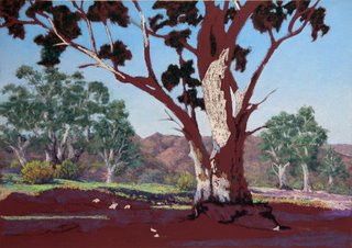
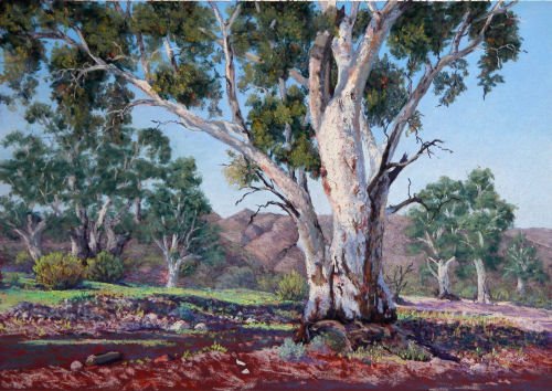
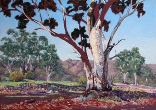
It was back into the studio for me this afternoon to do some more work on this painting.

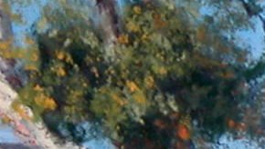
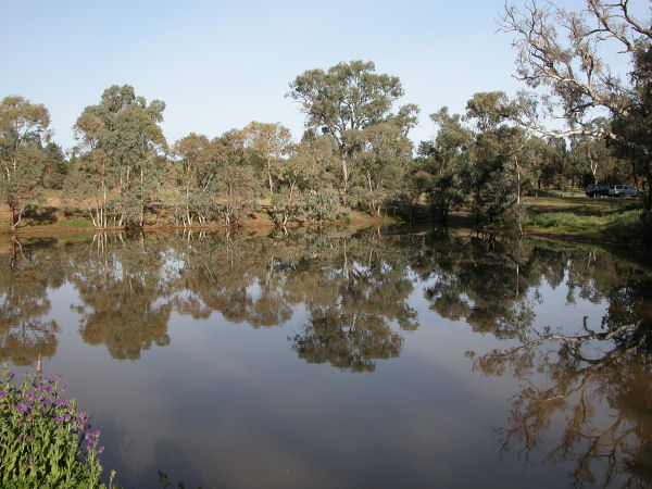
I worked on the middle ground to establish the eucalyptus gum trees as well as some of the native shrubs that grow in profusion in this area. There is a wealth of different varieties of vegetation in this area which allows me to have some fun with colour.

The tree in the foreground will have foliage hang down in front of the middle ground trees on the left hand side yet. It will help to connect the two areas together at the same time pushing the background further back. Well this is the general idea of it anyway.

I am uncertain of the road that comes in at the right. It is part of the creek bed as well. The creek runs across the road to the right, not with the road. The road heads off into the distance behind the tree and can’t help but feel it causes some confuses. I may brush this area off and think a bit more about the placement of the tonal values. Maybe even drop the right hand side down a bit to see what happens. Gosh I might even end up with vegetation there yet.

As you can see I have started placing some marks on the foreground tree. I decided to call it quits for now as I need to feel fresher for the next stage, which a hit of caffeine isn’t helping.

So until tomorrow, cheers!

Saturday, May 06, 2006

You are not forgotten :)

Not feeling crash hot today as I have spent most of it in bed with a migraine. I haven’t any progress work to post but did want to pop in let you know I have not forgotten you all.

Friday, May 05, 2006

Brachina Gorge (WIP) two

I picked out the main areas that is going to have the lightest lights on the tree trunks and stones.

I worked on the background mountains that may need some adjusting but for now will be left alone until more progress is made over the paper.

Some of the darks in the tree canopies were put in place and worked the sky around these areas.

I did blend the sky but ever so lightly using my little finger so that light pressure was applied. If I applied too much pressure, the tone of the burgundy paper would make some of the sky look dirty from pastel becoming thin and transparent.

Thanks for looking.

Thursday, May 04, 2006

Brachina Gorge (WIP) one

This work in progress (WIP) is from the Central Flinders area of South Australia.

Burgundy AS Colourfix Paper
475 x 330mm

As you can see I have done my tonal map to help guide me plus this also helps me to get to know the piece that I am going to work on.

Wednesday, May 03, 2006

Wood Duck Dam

This is a nice little picnic area a short drive north of the T Junction turn off into Wilpena Pound. It isn’t far off the main rubble road and yet after many visits to the area, it wasn’t until my last trip to Wilpena Pound that I visited this tranquil spot.

The more tranquil a man becomes, the greater is his success, his influence, his power for good. Calmness of mind is one of the beautiful jewels of wisdom.
- James Allen


Monday, May 01, 2006

Vase Drawing

Even though I love to draw I don’t do enough of it just for pleasure alone.

A tonal value sketch is a good exercise to keep your eyes sharp and the drawing hand in tune with what you see, not what you think you see.

Today while watching the rain sprinkling down through my studio window it was lovely just to sit at a table and draw from life this little vase that has been in my procession for a considerable amount of years.

The drawing isn’t perfect but it was enjoyable.

Drawing is the honesty of the art. There is no possibility of cheating. It is either good or bad.
- Salvador Dali