Why you say do I need to test? It is very handy when tweaking your template to see what the column widths look like in different size browsers or how much scrolling will be involved for your visitors. This may not be fool proof although it just might be of some value when designing your blog or web
By typing or copy and paste javascript:window.resizeTo(800,600); in your browser window then press enter it will resize your browser instantly to a 800 x 600 resolution. Try it and see what happens.
You have a huge monitor and want a different size? That is easy to do; just change the (800,600) size to the window that you require.
Want it to be easier still? Click on each link below to see how each resizes to a new window resolution. You can drag the links to your bookmark bar or into a folder in your Favourites Folder to create bookmarks so that you can test quickly.
800 x 600
1024 x 768
1280 x 800
The size window isn't there that you want? Oh come on you don't think I am going to list them all do ya! Hey but I will show you how to make your own using Firefox.
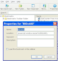
 On the Firefox toolbar click on Bookmarks then go to Organize Bookmarks. A new window will open up. In that new window click on the New Bookmark button. You can also access this by going to File then New Bookmark. Fill in the new bookmark as you see in the image I have provided replacing 800,600 with the screen resolution that you want.
This new bookmark can be placed in any folder that you require to make it easier to find when needed.
There is also another tool that you can use to resize your browser by Web Developer that adds an extension onto Firefox. I did try it out but found that I preferred to use the bookmark method because the add on has a lot more tools than I require, as well it places another menu on my toolbar that takes up space.
The ideal way to check your screen resolution is by changing your 'Windows' monitor settings. I do this by right clicking on my screen on the desktop, choose Properties then Settings. Make a note of the screen resolution that you are using so that you know what to set it back at later. Move the slider to the new screen resolution that you want and expect your screen to go blank for a second or two when you click OK so don't freak out when this happens. Click yes when the screen comes back and check your website or blog and see how it looks at a lower or higher resolution. Once you are finished, go through the same process and choose your original screen resolution and click yes once more. I have come to the conclusion that this last method is the best way to check screens at a higher resolution because fonts and images are resized as well giving a true picture of what is happening.
And there ends this lesson!
Quick links:
![]() technorati tags: javascripts, resize browsers, firefox, blog, ,
technorati tags: javascripts, resize browsers, firefox, blog, ,
4 comments:
Susan - I'm finding that your blog is taking ages to load. I don't know if this is a temporary problem or not but I'm not having a problem with anybody else's
Katherine is the post part of the blog slow to load as well as the sidebar?
I am guessing it is the carnival post that is the culprit as my logo is part of the code that is given to me and actually on the carnival website.
This is why I need to know if the post are slow to load as well as the sidebar. I can host the logo myself to eliminate the problem in future.
Susan - it's working fine now. Maybe your host was having a day off?
I've blogged this post in my new weekly round-up - come and take a look!
Thanks that is a relief. Off to check out your weekly round-up now. :D
Post a Comment